community blog with contributions from East Central University students enrolled in Digital Imaging I and Digital Imaging II. Students are expected to maintain a constant presence by posting assignments, tutorials, and other useful info related to class.
Friday, May 20, 2011
Macho Man Randy Savage
http://www.tmz.com/2011/05/20/randy-savage-car-accident-macho-man-dead-dies-died-killed-wwe-wrestler-florida/
Friday, May 6, 2011
Thursday, May 5, 2011
Nathan Hensley Final Project
to view my final project visit my blog at
von86.blogspot.com
D2 Final Project 2011 Pina
For my final project I chose to do a candle store chain called BLUE MOON CANDLES. My slogan for this company is "Candles that make scents." For my web page I chose to create a soothing environment by using light colors. For the labels I chose to identify the scents of my candles with pictures.

I made another company that wasn't quite as serious. This ice cream company is aimed for younger children or just grown ups who like to feel like kids from time to time and let go of daily stresses by enjoying some frozen desserts. My ice cream company is called BIG SCOOP. My slogan is "What's your flavor?" It seemed like a good slogan because no matter how many ice cream flavors you try you always have that one favorite flavor. I created a menu, some apparel that employees wear or if a customer would like to purchase them they could, my web page which I tried to make more fun by using colors that pop, a cute little ice cream shop, my billboard that would pass the 75 mph test, and an ice cream truck (which are fun no matter how old you are).
D2 Final Project Hines
My Project is called Noir Nature and is located at:
http://noirnature.blogspot.com/
http://noirnature.blogspot.com/
D2 Final Gaither
This is my final project. I created a fast food restaurant that survives healthy food. The name of my company is called "The green Tomato".
The company product is healthy food that is for people on the go, Store location is all over the united states and making its way across the oceans. The target customer is for every age and to get the customer to eat more health even when they are to busy to stop and cook a healthy meal.
My company name is "The green Tamoto" and the moto is "straight from the garden to you".
As you can see this is the logo and my moto for the restaurant. I wanted it to be semple but to be eye caching. The other logo is the logo i used for on the trucks, cups, bags and the carry out containers.

This is the shirts that the workers wear they are simple black with a bright green and yellow green logo on the left side and the back of the shirt has just the tomato at the bass of the back of the neck.


This is the truck for the food delivers i choose to use a simple logo that was easer to see and read as it gose 70 miles an hour down the road.

These are the packaging. I use the same logo as i did on the trucks. It is simple and a clean look. This logo is easier to see and can be mass produce easier.


This is my fast food restaurant i choose a simple but modern building. I made my logo pop and the sign with just a simple tomato with black around both the tomato and the logo.

This is my web page i went with simple with an advertisment of a new smoothie with the moto and logo at the top.

These are the window clings i went with simple but fun to get a younger customers.


This is my menu i went with simple with black and bright green to draw the eye.

These are my billboards i went with black and bright green to draw in the eye but also simple.


My video would not loud sorry and it was good.
Making this business i went with a simple look with eye caching colors. That some of items have a little humor to draw in consumers of all age.
D2 Final Project Miller
http://mdgraphicdesigns.blogspot.com/
Here is the link to the blog I created for my final project
Here is the link to the blog I created for my final project
D1 open Series/flash animation explanation.
Ok, pretty much my open series and flash animation is about people. In that we are all just meat with a soul, were are made up of the same stuff; its Almost the like the the way the companies or institutions look at the people in general. There might be something about superficiality in my pieces. We may look different and have our own personalities but no matter who you are just another one like the rest. It is hard to explain because when i made these pieces they had no purpose or meaning, but if they had one it would be that.
Have a great summer everybody!
Have a great summer everybody!
D1 Spears Flash movie 2
http://www.youtube.com/watch?v=xxtHhUXDAaM
http://www.youtube.com/watch?v=YPpCViRlpMU
D1 Flash Series - Boydstun
The theme for my flash videos is a extension of my "little people in a BIG world" theme from the open series.
thought it might be interesting to see what really happened to the little guy Nichole was stepping on....
D1 Flash, Candace Sweatt
Yeah, uh...I know, I know...I could totally sum up my pathetic attempt at using Flash as something akin to beating one's head against a brick wall. Repeatedly. I obviously had no clue what I was doing. Honestly, Flash is very intimidating to me and I don't have much to say for myself in regards to my horrible attempt at this assignment. I blew it...
D1 Final Turner
For my open series I chose to put recognizable figures in places you wouldn't expect, so I just took two of my open series characters and put them into flash.
For the Abe In Space I created a new, smaller Abe and added a hat, just because I wanted to. I couldn't find any convincing space sounds that I really liked, so I just spiced it up with some Elton John.
For Zombie Elvis, I made a new Elvis in Photoshop but changing the saturation and the hue, and made him more zombie-ish with dark, low opacity soft brushes. The clouds move in the background, I wish it was more noticeable though.
I don't like Flash. I hope everyone likes the end product.
D1 Final Hale
My flash animations were based on my open series that no one seemed to understand at all, so I doubt anyone will like these either. They both malfunctioned in some way or another and I'll probably do everything in my power to never use flash again. The monkey one got smashed once it was uploaded and the Bono video got its music track messed up for no reason, and I made about 4 other videos, all of which were either too big for the stage (The stage has a maximum size actually) or becoming too complicated to actually work. I am not proud of these.
D1 flash series 2- J. CLARK
my open series idea was abstract art. this made made my makin a video very challenging for me but i came up with some ideas. i used my landscape abstract art to create a video of some cars driving across the road.. and in my second video, i used my cat image to make a cat move from one side to the other and then blend in with the white cat to make a grey image.. after that the cat then leaves and comes back onto the screen and slowly fades into a white cat.... i did this thru multiple layers of just barley moving the image until i got it where i wanted it. and after doing that i copied each layer individually(which took forever)!!! n put all the imges together to get what your about to see.. hope you guys like it... :)
D1 Flash Series # Sijan
For my final project in flash, I used 'transition of time' as my theme. For the first video I tried to illustrate the life cycle of human from birth to death and for my second i used the evolution of mankind to show how mankind have developed from early age to the modern world.
Wednesday, May 4, 2011
D1 Portel Bellamy Flash Final
D1. Portel Bellamy Flash Final
So I know I post some videos earlier, but I lost my thumb drive, so I needed to make some new videos for the critique tomorrow, so here are my new videos. My earlier comments still apply to this project, but I did try to make them a bit longer and add a few more details, anyways, I hope these are somewhat of an improvement.
D1 Flash Final Robinson
My flash had to do with gun violence. my first one i made Tony Montana as a mobster shooting a machine gun towards the "camera". The second i had a little trouble with so it is not as well thought out as the other. the different colored guns are supposed to symbolize toy guns that kids play with and the superhero at the end comes in to "save the day" so to speak.
D1 Flash Series- Hopkins
I used the same concept from my open series on my flash videos. Since it's been a few weeks.. my theme was about how time management is a big stress factor for me and it will either make or break if I am able to complete all my tasks for the day, week, etc..
On my first video I used a clock that I found on the internet that I also used in part of my open series. I liked this clock because its spiral design gives it this warped look and it makes me feel like it is never going to end. I used a different layer for the car and created the motion tween to look as if the car is driving down into the clock.
The second video was a little more fun to make because I was more familiar with flash and the making of tweens. When I was putting it together I was thinking about the scene from Office Space when they take the copy machine out into the field and beat it to shreds. So- like the movie- I put my alarm clock in a field and I took a golf club to it. I added a couple different sound effects to this one to play up the drama.
Critique in the morning D1
If EVERYONE has their Flash projects on the blog before 9:30 like requested we can plan to wrap up the Final quickly. So please get your things on the blog NOW. thanks
D1 Flash Series -Dozier
My flash animations that go along with my open series. An argument for an existence of God versus science being able to explain everything. Roulette animation demonstrates the odds of things coming together to support human life. Quantum Physics animation illustrates and argument heard about quantum physics that I was given by atheists and how things derive. Also mocking the fact that they disagree with magical happenings in the bible but not with their own magical explanations...
I had difficulty with the audio continuing after the animation and into the looping video... I exported as a quicktime but it messed with both movies. The random sun in the roulette and brain at the end of quantum physics. I will try to find a fix and will repost if I can.
D1. Portel Bellamy - Flash Projects
D1. Portel Bellamy - Flash Projects.
please read previous post for comments.
D1. Portel Bellamy - Flash Projects
D1. Portel Bellamy - Flash Projects
I know... and I'm not happy. These projects were tough enough as is and then trying to make something that related to my open series and trying to learn how to use flash within our timeframe and to be at a level of a good enough fundamental basis was extremely difficult given the time that I had (finals week). By all means, I know that my work here is not something that I consider good, but I did come away from this project with a new respect for the program and potential future plans for flash applications and with a better understanding of how to use some of the programs capabilities. I tried learning the program by using numerous youtube videos which for the most part were not great guides, but I did learn most of my flash skills by doing so. Anyways, this is what I got, and I hope you guys have better luck with your projects.
Monday, May 2, 2011
Final Projects
D1 - you can go ahead and post your projects, but please post them in the same blog post.
D2 - you may also go ahead and begin posting, but PLEASE keep all projects in the same post. If you want to you may create your own blog and post to that and then post a link to it on our blog. That would probably be best considering how many pieces will be submitted. Creating a blog should take you no more than 5 minutes and you could continue using it in the future to host your portfolio to show employers. A blog is a cheap alternative to having your own website. And you WILL need something if you are going to try to get a job in graphic design.
D2 - you may also go ahead and begin posting, but PLEASE keep all projects in the same post. If you want to you may create your own blog and post to that and then post a link to it on our blog. That would probably be best considering how many pieces will be submitted. Creating a blog should take you no more than 5 minutes and you could continue using it in the future to host your portfolio to show employers. A blog is a cheap alternative to having your own website. And you WILL need something if you are going to try to get a job in graphic design.
Thursday, April 28, 2011
D1 Passage of Time- Hopkins
My passage of time was over the life and death of a radish. I used 5 fps. It would have been more effective if I would have used a tri-pod because the frames kind of jump around.
Shout out to Austin and Portel for their help :)
D1 Time Lapse/Passage of time - Boydstun
This is my time lapse for the Passage of Time assignment to make up for the Way-too-shortness of my stop motion video.
I set a camera up in the front of my car on the dash board to record the lightning.... sorry the first half is pretty boring...
I set a camera up in the front of my car on the dash board to record the lightning.... sorry the first half is pretty boring...
D1 Stop Motion/Passage of time - Boydstun
It's way too short I know... I made a Time Lapse video to make up for the way-too-shortness.
I'm working on uploading my it right now...
Well..
I'm having issues.
Apparently my movie is to big. I uploaded it to YouTube and it is only playing like the top-left corner of the movie.
help?
D1 Stop Motion Turner
http://www.youtube.com/watch?v=olxByHPMGrM
For some reason a white box keeps appearing but I will repost later at higher quality
D1 time lapse # Sijan
For my assignment on time lapse, I drove around the city of Ada and choose the best pictures to make the video. Or choose the best timing since i could not use all the pictures to make the video since they were too large. I found the track on , youtube which was titled " ink the complete soundtrack : tick tock " and then converted the youtube video to mp3 from the free website found via google. Since, i used iMovie to make the video i used a little more features available on the iMovie, the title name and the globe in the beginning .
D1. Portel Bellamy - TImelapse
D1. Portel Bellamy - Time lapse
Here is my time lapse. I call it (super awesome easter roller coaster) Surprise. I just got a K'new roller coaster kit and made it for my nephew and nieces and took numerous photos during the process. I took about 270 images at a 5 fps rate. I got the song form a website called incompetech.com because it had copy-right free music (just in case Youtube took the song off). The song is called Ropocalyse 2 just in cause you want it. And yeah, I know the song is ridiculous, but I thought it was funny, so it stayed. Anyways, if you have any questions just let me know and I hope you enjoy it. Thanks.
D1 Still trying #4 Passage of Time Filipelli
This is my greenery in my backyard over the last few weeks. The birds kept getting my strawberries. Pamela
D1-J.Clark Passage of Time (just in case)
Got on this mornin an had one comment n then it wouldnt let me view the video so i put this one up just to be safe...
D1 3rd attempt Passage of Time Filipelli
Well, let's see if this doesn't make you sick. It's a bunch of pix of walking through my empty new house.
D1 Passage of Time (Stop Motion) Hale
http://www.youtube.com/watch?v=TBogd3NyjKY
I am going to try to upload a higher quality version in class, I just wanted to make sure I got a copy in on time
I am going to try to upload a higher quality version in class, I just wanted to make sure I got a copy in on time
Wednesday, April 27, 2011
Second attempt D1 Passage of Time Filipelli
Okay, here goes . . . OMG, I just previewed it. I'm motion sick. It gives a 360 degree effect.
I took a series of pictures of my workspace from three different points in the room over the whole semester. This is the compilation of those pictures. If it was not so frustrating to try to get this stuff posted, I would try to post pix from just one point. With the software quitting mid-operation and all the different stuff happening to the computers in the lab, I just am getting very tired of this project. :( Pamela
D1 McDaniel Passage of Time
I had the same problem as Austin, after converting to quiktime it cut out the first few frames and it threw the timing off a little with the music.
HELP!!
been in the lab forever it seems tryin to upload this video but flash keeps on shutting down!!! does anyone know what to do...
Tuesday, April 26, 2011
D1 Passage of Time- Dozier
Something I think we can all appreciate...
Unfortunately the banana was not rotting very quickly for me, which is strange because usually I can't keep them fresh when I buy them... Anyways, the fruit flies I collected during the shooting of this need to leave my room now! haha
D1 Hamm- Passage of time/ Stop motion
Here is my passage of time/ Stop motion project. Sorry that it is really choppy, it was already choppy just because it was a stop motion, but once I uploaded to YouTube it got worse and actually left out some frames for some reason.
D1 Passage of Time-first try Filipelli
TECHNICAL DIFFICULTIES
It is suppose to run my pix of my workspace all semester long.
Thursday, April 21, 2011
D1Tutorial 5 Robinson

Find photos to use for your recycling image.


use the quick select tool or magic wand to select each part of the recycle symbol. Select the background image in this shape and copy and paste into new layer. Flatten this image.
After you get all three pieces where you want them add a gradient and adjust the settings to get the look you want. Add color. Next add a drop shadow and soft edge from the effects menu to make it look more 3D. Burn and dodge the edges where the highlights and shadows appear. You could add some spotlights or other lighting effects.
You can change the colors in the gradient mask.
Finished image
dig1tut5brenna
Find a picture and desaturate adjust levels. 58 1.00 73 you can also use the cut out filter and set to 2-3-2. The rain is kind of tricky as you can see from my example.
D1 Tutorial #5 Sijan
Photo Stylizing Effect by Fragments
1. Open a picture and change its size to 600 x n750 pixels.
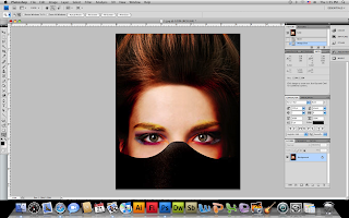
2. open a new document , size 55 x 55 and draw a pattern with pencil tool 1 px, you can only draw a black and a white dot.
3. Save the document as a pattern by edit>define pattern. After that open the main document and fill it with paint bucket tool using our new created pattern. With the pattern selected change the layer to overlay with opacity of 80%.
4. After that go back to our background layer. All the actions we will be making with it only. Get out the Rectangular Marquee Tool to create selection like on my screenshot below. Hold Shift button to get proportional to the square selection.
5. Once you have the rectangular area selected with the rectangular marquee tool, apply gaussian blur to the area. Filter > Blur > Gaussian blur.
6. Repeat the same blur step to apply to other areas. You can hit Ctrl + D, once you are done with the blur.
7. Right click on the layer, go to blending options and apply drop shadow and out glow to the image.
8. The final image :
D1 Tutorial #5 Jami Turner
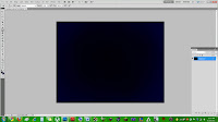 My tutorial is taking photographs, and transforming them into vanishing cubes in space.
Step 1: Make a background. I just filled the space with dark blue, then used a soft low opacity brush to add black to make more depth.
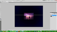 Step 2: Take a brightly colored photo, or one with lots of different colors. After you choose a pic, you're going to use the single row marquee tool to choose one line of pixels on the photo that you want to use. Copy the row of pixels, then paste them in a new layer. After this, delete the original photograph so that you are left with the thin line of pixels.
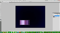 Step 3: Use free transform to make the line of pixels stretch in to thin stripes of color. You can make the block of lines any size you like.
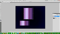 Step 4: Make a duplicate layer of the block of stripes, and free transform the duplicate layer to make the second block taller than the original. They should remain the same width.
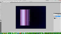 Step 5: Move the 2nd layer of stripes so that it lines up perfectly and connects to the original stripes.
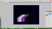 Step 6: After connecting them, while still using free transform, hold down the Ctrl button, and pull on the top middle dot to the right. This will stretch the stripes to create dimension without separating the top stripes from the bottom ones.
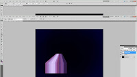 Step 7: Next, while still using free transform, hold down Ctrl-Alt-Shift, and pull on the top left dot to the right. This will make both of the top outside dots come closer to one another, giving the illusion of a cube being sucked into space.
 Step 2: Take a brightly colored photo, or one with lots of different colors. After you choose a pic, you're going to use the single row marquee tool to choose one line of pixels on the photo that you want to use. Copy the row of pixels, then paste them in a new layer. After this, delete the original photograph so that you are left with the thin line of pixels.
 Step 3: Use free transform to make the line of pixels stretch in to thin stripes of color. You can make the block of lines any size you like.
 Step 4: Make a duplicate layer of the block of stripes, and free transform the duplicate layer to make the second block taller than the original. They should remain the same width.
 Step 5: Move the 2nd layer of stripes so that it lines up perfectly and connects to the original stripes.
 Step 6: After connecting them, while still using free transform, hold down the Ctrl button, and pull on the top middle dot to the right. This will stretch the stripes to create dimension without separating the top stripes from the bottom ones.
 Step 7: Next, while still using free transform, hold down Ctrl-Alt-Shift, and pull on the top left dot to the right. This will make both of the top outside dots come closer to one another, giving the illusion of a cube being sucked into space.
Subscribe to:
Comments (Atom)


