Monday, January 30, 2012

D2 Tutorial 1 Spears

How to Create a Pattern Overlay for Text

1. Make your text or object.
2. Make sure you edit the text to where you want it.
3. Select the text and create outlines as shown below.


4. You may want to ungroup at this time especially if you are only going to apply a pattern overlay to only one letter.


5. At this point, you will need to make your pattern. (I will show you how to make a checkered pattern for this particular tutorial.)

6. Select the rectangle tool. 


7. Make your shape while holding shift to make a square.

8. Split your square into a grid by going to "object", "path", and then on down to "split into grid...".


9. It will bring you to a window that will enable you to edit the settings on the grid. Adjust the number on the rows and columns to "8", then adjust the gutters to "0".

10. You will now have a grid. To get the checkered pattern, you will need to take the "live paint bucket" that is within the "shape builder" tool.


11. Fill in every other square until you have the checkered pattern. (I reduced the size of the pattern to fit the "P".)
(this image include the word I chose for this tutorial as well)

12. Select the checkered pattern you just made with the black pointer and place it directly over the letter you would like to apply the pattern to.

13. Arrange the pattern behind the letter.

14. Select both of the objects with the black pointer and create a clipping mask by right clicking and selecting "make clipping mask".

(For better legibility I also enlarged the size of the "P" and added a black 3 pt. stroke.)

This is the final image.


(P.S. This can also be applied to an object)

Enjoy!


D2 Tutorial #1 Hale


D2 new assignment (also on Bb)

Look at examples of enclosure logos in Bb and online.

Design at least (that means several) one "enclosure" logo for each of the following scenarios.  The main objective for these logos is to work with a limited color palette.  All logos will use a monochromatic color scheme.  What is that?


You may use these tones in varying amounts, but all must be present.  You'll find that swapping these different tones between graphic elements will be helpful in creating a dynamic composition that is also versatile and readable (80 MPH test).

Part 1.  Wallace Flowers and Gifts
This is an upscale chain of 3 locations located in Edmond, Nichols Hills, and The Village.  They want an elegant and sophisticated yet refined logo.  An enclosure logo style is ideal for this.  The company also doesn't want the logo to look trendy or vintage.  A timeless look is what they are after.  This means that in 75 years they intend to be using this same logo and the logo should hold up as well then as it does now.
The choice of prismatic color is up to the designer as well as the style of enclosure.

Colors to use in the logo

1 = Prismatic color of your choice
1 = same CMYK at 50% saturation
1 = same CMYK at 70% saturation
1 = same CMYK at 85% saturation


Part 2.     The Cutting Board - Purveyors of Fine Cookware and Kitchen Implements
This is a national chain that mostly focuses on fine dining establishments, private chefs, and the wealthy.  There stores only carry high end merchandise.
Obviously, the stores full name is quit long so they would like 2 versions of their logo.  One that is full and includes everything and that only includes the first part.  The reason is because they want one that is easy to read from great distances and one that they can put on the bags, labels, etc.

1 = Prismatic color of your choice
1 = same CMYK at 50% saturation
1 = same CMYK at 70% saturation
1 = same CMYK at 85% saturation

Stay tuned for a due date, but it will likely be Thursday during class.

some thoughts on the tutorials

Now that the tutorials are starting to roll in I feel the need to say that most of them are either too short (the technique shown is very simple) or too basic (the technique shown is one that everyone already knows how to do).

This mostly concerns D1 as of right now.

Im not saying that you tutorial needs to be 20 steps, but it needs to over a topic that requires more than 2 - 5 steps.  They should also show the class something new.

D2 tutorial

Creating a gradient brush stroke.

You can start with any shape, but for this tutorial I'll be using squares.
You place 3 squares with different colors, or two if you want a less complex gradient.

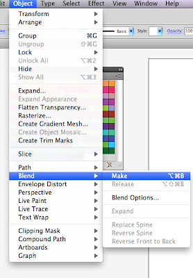
Once you have the squares placed, you will select all of them and then go Object>Blend>Make
It should look something like this
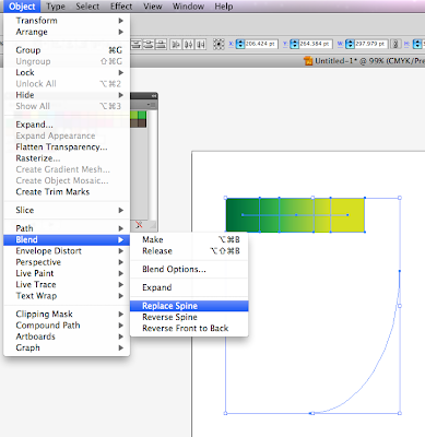
After that you will need to make a path, and once the path is made you will select both the gradient and the path and go to Object>Blend>Replace Spine
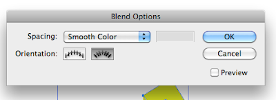
The path may be blocky depending on what shape you used, if it is you will go to Object>Blend>Blend Options then click the align to path button (one on the right)
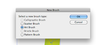
To make the gradient a brush take the blend and drag it into the Brushes panel. Choose “New Art Brush.” You can leave everything in the Art Brush Options box as it is, or experiment with different colorization settings.
Once you've finished that you can select it from the brushes panel and use it just like any other brush!


D1~ Erica~ Tutorial #1

How to add a stache to an unsuspecting victims photo

Open both images in Photoshop (their are plenty of images of staches on the web)


Using the Magic Wand Tool on the Mustache image, select the mustache of your choosing.

Edit~ Copy ~click on the victims photo and Edit~ Paste

Make sure the mustache Layer is selected and use the Move Tool

You can now position and size it however you like, just hit return when it is the shape you want.


Hee-hee!

D2 Tutorial #1 Turner

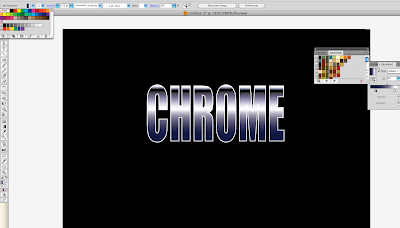
This tutorial is going to show how to produce chrome text easily using illustrator.
Step 1: Select the font you want to use. I chose to go with impact because it is very clean and easy to read.
Step 2: Go to Type > Create Outlines to convert your letters into solid shapes.
Step 3: Now you're going to want to give your text a gradient so that you will start to get a nice metallic look to your font. When you add the gradient it will be vertical, so you will have to change the angle so it is going horizontally over the font.
Step 4: Now you will change the colors of your gradient. I went for blacks, whites, and dark blues on my letters. You can also add as many color swatches as you desire to your font, for more variety in the chrome effect.
Step 5: Select the text and head to Object > Path > Offset Path. In the options box enter an offset of -0.75mm, then right click on the text to ungroup it.
Step 6: After setting my color swatches the white on the font blends into the background, so I used the rectangle tool, selected the entire image size, made the fill black, and then arranged the rectangle, sending it to the back so that the font would be uncovered.
Step 7: Now my font blends with the black background in places, but I want to keep the black, so I add a .75 pt stroke in white so that the word pops from the background.


D1-Tutorial #1 Clone Stamping

The cloning stamp is used to create more of something and erase as well.

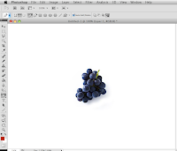
Select a picture
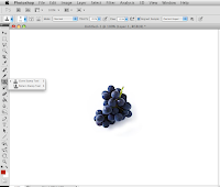
Choose the Clone Stamp Tool on the left side bar.
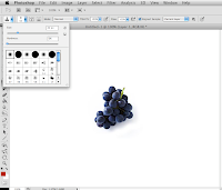
On the top left hand corner near the clone stamp choose your desired hardness and size.
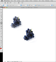

Place your circle on image hold mouse and alt down to select area and then place where desired cloning, click.

TA-DA!


While I Was Working on Homework Last Night . . .


I stumbled across this video while I was working on my paper for my Persuasive Writing class. (I'm writing an analysis of one of Rick Perry's ads.)

D1 Tutorial #1


How to get red eye out?

First open your picture that you want to fix.
Zoom in, select red eye tool behind spot healing brush.
click on each eye to get the red eye out.
Zoom out and you have your finished photo!

D2 Tutorial 1: How to Create a Gradient Swatch in Illustrator

1. Open a new document as usual.


2. Type in the text using the Type tool (the "T" box highlighted in red) in the left-hand toolbar.


3. Click on the selection tool (the black arrow).


4. Click on Type > Create Outlines. If you do not do this, you won't be able to change gradient colors! You will end working with boring black, white, and gray.


5. Click on Window > Gradient. The gradient toolbar should pop up on the right side of the screen.


6. To create your gradient swatch, click on any of the box-looking slides (highlighted in red) at the bottom of the gradient bar (highlighted in blue).


7. There are many different ways you can change the colors in your gradient swatch.

a. Click on "Swatches" (highlighted in red) and select a color.


b. Adjust the opacity of a color.


c. Adjust the amount of any color you choose by moving any of the slides along the gradient bar.


d. There is also the "Colors" option (highlighted in red). You can also adjust how much gray you want in your gradient swatch.


e. Adjust the type (linear or radial, highlighted in red), angle (highlighted in blue), and/or location (highlighted in green).


There's so much you can do!!!

8. To save your swatch, click on the down arrow next to the word "Type" (highlighted in red) and then on the floppy disc button (highlighted in blue).


9. Right beneath the top toolbar on the left side of the screen, click on the down arrow on the fill tool (highlighted in red). The swatches should automatically scroll down and the swatch you created should be highlighted in white. To name your swatch, click on "New Swatch" (highlighted in blue). A "New Swatch" dialog box should pop up.


10. In the "New Swatch" dialog box, type any word(s) into the white box next to "Swatch Name." Click OK.


And voila!