
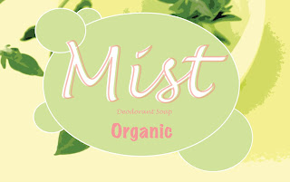
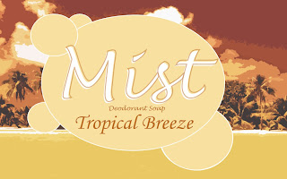
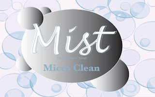
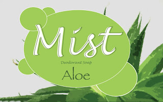

These are my designs for the Mist Deodorant Soap. The first one is the universal logo that I changed slightly depending on the variety of the soap. The Organic one seems a bit girly because of the color but I wanted to make it stand out from the green and that seemed to work well. The Tropical Breeze one is my least favorite, I think the color is a little harsh compared to the other varieties but other than that I like it. The Micro Clean one has a gradient on the bubble enclosure to represent a shiny texture like you see in toothpaste to represent cleanliness. I like the Aloe one because it's simple, which is why the Icy Blast one is one of my favorites as well.
1 comment:
I think that suggestion about simplifying or using some type of filter on those backgrounds made big improvements
Post a Comment