First you need to find/take a photograph of a face. I used a close up of one eye for the sake of the tutorial.
Next you need to find an image to layer, I found a nice large one of the Earth that has a solid background for easy erasing.
Now you will need to either select the subject off of the background or erase the background away from the subject, depending on which is easier. In this case since the earth is on a flat black background you can use the magic eraser tool found by right clicking the eraser button.

Click once on the black and you will see the checkered background telling you nothing is there.
Now you can easily select your subject.
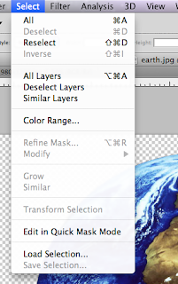
Go to Select in the options menu and click All. Then go to the Edit, also in the options menu and select Copy.

Switch windows over to your opened face/eye photograph and from Edit select the Paste option. Now you will have a solid earth on top of your face. It will automatically be on a different layer so nothing will happen to the first photograph as we edit the earth to fit and look right.
Set the Opacity somewhere in the mid-ranges so you can see the face behind the earth. This is important so you can get the earth to fit the iris of the eye correctly.
Now go to Edit and select Free Transform and re-size the earth to fit. It is ok that the part of the skin and eyelashes are covered. We will fix that in the next few steps.

Apply the transformation whenever you are pleased with the size.
Now for the finer tuning of the sizing go to Edit - Transform - Warp.
Pull in the edges to meet the edges of the Iris that show.
Select the eraser tool and pick a small size brush. Keep the hardness level at 90-95%, softened just enough so there is not a harsh edge but we don't want it too fuzzy either. Erase the earth where the eyelashes, eyelid and skin at the base of the eye are.
Go to the Layers box on the right side of your screen. Choose hard light filter for the earth layer.
Here is the finished project. Depending on your subjects photo you might have to choose a different filter that looks better and possibly play around with the saturation and light/dark.


2 comments:
That is pretty cool. I will have to try that.
I like this. Really nice effect!
Post a Comment