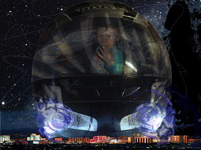


For the type one assignments, I included images that were easily relatedable to things that I think idenify me. I started by taking a motorcycle helmet since I have a love for my bike and its a visual link to who I am. In the visor of the helmet I added some imagary that reiterates myself; a picture of my daughter, my car and my motorcycle. I presented it as a reflection of the person inside the helmet. On the far right in the background I added a sihloette of me with a motorcycle helmet and my dreads that I had for a long time. Across the bottom of the work is the city of Reno, Nv my home town and a place I love and miss.
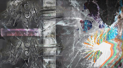
For the second type one self portriat, I went a more personal approach to things that would project a self portait. To me this is more of a tribute to my personal style and taste, along with some images that suit me. I wrote the word MASH to the left in a graffitti style. That is where i got my start in art in the seventh grade, and mash was my "tag name". I put 100 dollar bills in there because it motivates a lot of what I do and work hard for my cash! the background says a lot about my personal style and I also put a silhoette of a guy dancing with dreads. Because I did that all the time with my dreads.
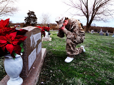
For the first type two assignments, I went with the story of a marine who survives a war in Iraq, only to return to his country and find that his wife and daughter have died in a car accident. So here he is shown mourning before their headstone.
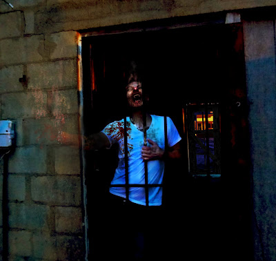
For the second type two photo, I thought about a post apocolyptic world where humans are at war with vampires. As the main characters are trying to find some shelter as the sun gets ready to set a vampire rush at them and runs into a cell door where he reaches for them, covered in blood, he starts to dissapate where the sun hits him.
4 comments:
good at photoshop bad at spelling lol ill start typing my blogs in word then paste them so i can use spell check lol
These look pretty good. I like the work that you did with the vampire piece. Are you in costume or did you 'shop the teeth, etc.
I also think the marine picture has potential. maybe a less dramatic pose (you were trying to hard, it comes off too intentional) like the moment before he knelt down. And it would have been interesting to see some color effects or grain effect to possibly make the image look less like a snap shot.
on the vampire everything is photoshopped i was only in a t shirt. I agree the pose said so much that it was really hard for me to manipulate it. There are som color effects i added orange to the background and just around the soldier i also added green to the grass to enhance it... if that is what you ment
i really like the vampire one too...especially because you edited as much as you did instead of putting in teeth and adding blood.
i think another idea that might help the soldier is some sort of memory images fading in the background or the open space above. it might negate having to get a different pose.
i liked the ideas of the first type of portrait to they made for some interesting pictures
Post a Comment