Thursday, April 7, 2011

D1- Open Series - Hopkins

My theme for this series was time, or the lack thereof. I chose this theme because as a full time student with a full time job, time, is something I wish that I had more of. Through the series I tried to illustrate a few of the obstacles that I face with the time I am allotted to split between school, work, and an almost non-existent social life. Each of my pictures has a different approach, so there is not one style that I used consistently. I used a lot of filters, blending methods, and played around with the values to add contrast.

D1 Open Series - Blake Stewart


Wednesday, April 6, 2011

D1.) Open Series - Portel Bellamy

D1. Open Series - Portel Bellamy


The theme that I decided to use was that of commercial and consumerism infiltrating our society through the insidious means by making there way into our mindsets at such a young age that a during the innocence minds of children it becomes almost no wonder that our culture is as materialistic as it is. I am doing so by showing the juxtaposition the idea of how a child's toy with is symbolic of the child's innocence and then decorating the toys with company logos that we later develop a connection with in our later lives. The pieces are called the View Ur Master, the Build'em Up Young, the Speak and Sell, the Rubix Cubilitism, and the See 'n Pay. Most of the logos are not displayed at 100% opacity so that it is more symbolic of how they are not as aggressive of their methods, but are still in clear enough view so that there brand becomes associated with the joy that the toy brings. The toys with the names on them have also been changed to give the piece an saddening but ironic tone as it is related to our modern culture. If you have any further questions about the pieces please let me know. Thank you.

Please test your images

After you have uploaded your images, please check the post to see if you can enlarge them by clicking on them.  If you can't enlarge them please upload a larger image.

D1 Open Series -Dozier


The theme behind my series is an argument for the existence of a God. I am not arguing for any religion in particular as I am not a highly religious person. These pieces ask the question of, "What are the odds of all of these things just coming together to form the universe, earth, and the beings of the earth?" It ties the relationship between the creations together with gambling to represent the relationship between the odds of getting the right thing in order to be successful. There are also a few parts in some of the pieces to sort of mock the idea of science being able to explain everything.


D1 Open Series McDaniel


My theme is apocalyptic America, mostly Washington D.C. Each image shows what a few of Washington D.C.'s most notable buildings might look like after a nuclear apocalypse. (there is one image that is set in New York and not Washington D.C.) The one thing I did the most with these images is overlaying textures onto the images, however I did not specifically use the option overlay on all of them. Then I would go into the textures with an eraser and a paint brush to make the cracks or clouds look more believable. I also used the burn and dodge tool a lot to darken shadows and lighten highlights.

This Week in Unnecessary Censorship

FRAT LIFE...CAUTION...BAD LANGUAGE!!!

Hilarious Drunk guy buy the beer.

Tuesday, April 5, 2011

D1 Open Series

Since there are a total of 5 pieces that need to be turned in you should try to make your posts as small as possible.

So leave your images large when you upload, but choose the "small" option once they are uploaded.  This will make them appear small on the blog, but allow users to click on them to enlarge them for easier viewing.

All 5 are due on the Blog BEFORE class on Thursday along with a detailed description of your series.  Please include your theme and style and explain what you are trying to accomplish with the series.

If EVERYONE does this in a timely manner, we will have the critique on the blog instead of in class and I will do a Flash demo on Thursday instead.  You will ALL be required to make several comments on your peers' work if we do a blog critique.  I will reduce grades if comments are not made.  And useless comments like, "cool," "I love it," "this is great," etc. DO NOT COUNT.  Comments should be thoughtful remarks on WHY you feel the way you feel and also suggestions for how a piece could be improved.  

D2 Packaging Hines

My products are competing jelly bean companies. One is a bag the other is a box. One is marketed towards people with green on the mind, without actually being green, the other is for gamers with the classic look to it. The bag is in 3 parts, the bag, tag and string.


real or fake?

Free time with PS Brandon A

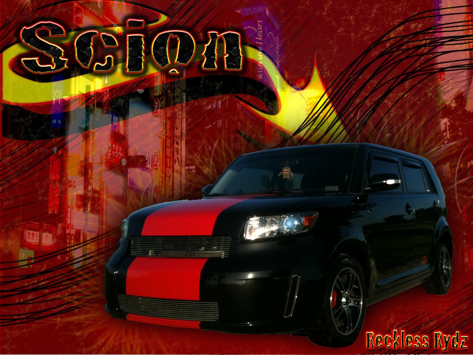
Let me know what you think? Aaron...you can hold off on the minivan/toaster/frigid air jokes, i get it lol

D2 Packaging Brandon A

Shoe boxes, I have to see these damn things every day at work so I figured I would try to make my own. All the ones I see are always simplistic in design "unless its like Ed Hardy or something" and have the logo or name highly repeated. If I had to pick the winner of the two...110 Performance. I think the logo is more creative and the lines just seem like they work. with it.

D2 Soda Packs Nathan Hensley


D2 Package


Here are my cereal boxes I created. They are both chocolate cereals but the first one has marshmallows in them.

D2 Package 1 & 2 Pina


These are my cupcake boxes. Like many competitors in real life there are some similarities and some major differences. 

Monday, April 4, 2011

Pakes 1&2 Gaither


These are my wine boxes i was trying to make them look simple. The first two i wanted them to seem cheerful and have cool colors as to feel like a spring wine. The last two i tried to make look elegant and simple. the first two are competing products of each other and the last two are competing products.

in honor of the chair throwing wrestling fans