Tuesday, January 31, 2012
D1 Passage of time Proposal - Christian
The fluxuation of the people in church getting to their seats and then leaving every service.
Passage of time proposal- Amie
My desk at home is always cluttered, so I wanted to find out exactly how it gets that way. I will be taking daily photos of my desk as it collects junk. It will start out clean, but pretty soon it will be a jumbling mess. I may have to re-clean the desk between now and then but will continue taking photos.
D1 tutorial 01 image tearing away into many pieces very cool
narating is very lame and there is a part about 9 to 10 min in when i try to change what i did n had to take a lot longer than expected so i paused the vid so it kinda jumps from me being confused to the almost fixed image
Passage of Time_Crystal
I'm going to try and create a stop motion (cartoon) scene while using the seasonal changes to show time.....
D1 Old to New/ New to Old Sara
Reposting the last assignment now that I have a working gmail account :)


D1-How to Create a Car in Motion- Crystal

2. Take the Polygonal Lasso Tool and outline the car. Go to [Select-Save Selection] and give it a title.

4. On the "motion" layer go to [Filter-Blur-Motion Blur]

5. Create a layer mask on the "motion" layer and load the Car into the picture.

6. Take the Polygonal Tool again and outline the tires. Once selected go to [Edit-Copy Merged], create a new image and paste the tires to the new page.

7. With the tire selected on the new page, select [Filter-Blur-Radial Blur] you might have to try different amounts according to your picture. Re-Select the tire and Copy, go back to your original image and paste the altered tire.
8. Do this same thing to all the tires and Re-touch any areas with shading.

D1
2 class periods plus homework time.
Begin by scanning or acquiring at least 20 photos and save them to your flash drive.
Now make a new project in Photoshop that dimensions of 20 x 15.
Using fragments from every photo that you collected, create an ambitious new image / composition.
Suggested subjects might be to create a landscape, cityscape, still life, or portrait. Regardless of the subject, you should use good judgment and what you know about the elements and principles of design.
Your compositions should not be flat. You need to create a sense of deep space in the picture.
You will be using the polygon lasso tool and possibly the magic wand tool and marquee tools to select the fragments. The Edit, Copy, and Edit, Paste onto your new project. Doing this will create new layers. You may rearrange the layers and even use layer adjustments and color adjustments, but you may NOT use filters, shape tools, dodge and burn, text, or brushes.
These need to be ambitious projects. To earn an A, you need to scan at least half of your source images, create a visually interesting and complex and though provoking composition, follow the rules of the assignment, and use class time wisely.
D1 - Passage of Time Proposal - Raechel Bible
I'm going to grow 2 plants of the same kind. I will keep one outside and keep one inside.
D1- first tutorial- Raechel Bible
I'm going to show you how to cover up a tattoo. this could also be used to cover up anything that you might not want in your picture, like a skin mark or something.
1. open up your picture in photo shop.

2. find the clone stamp tool in the tool menu on the left side of your screen.


1. open up your picture in photo shop.

2. find the clone stamp tool in the tool menu on the left side of your screen.

3. find your brush size menu and adjust the size to appropriate for the size of the photo you are working on. in this case a size 14 brush will be fine. also make sure the hardness of your brush is low or you will have a ring where you corrected the photo.

4. next hold down the alt key while clicking on an area of skin that is not covered by the tattoo. where you click will be the sample used to cover the tattoo. hold the circle over part of the tattoo and click to start covering.
5. you will have to keep sampling moving around the area where the tattoo is. using a sample of skin the is close to the tattoo will help the cover up look more realistic because you are using the same skin tone. and in just a few easy steps you have successfully covered up the tattoo!

D1 Passage of Time Sara
A Tale of Two Shadows: The journey of a shadow from Sunrise to Sunset, Late Winter and Mid-Spring.


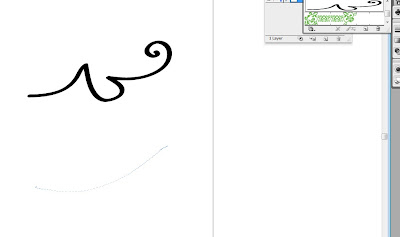
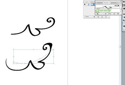
D1 Tutorial One Sara
I'm going to show you how to make light swirls like you see around cell phones in commercials or coming from a keyhole when magic is being done behind the door....
1.First start with a photo, I selected one at random and made the background black. Apparently my sshot of the black screen didn't come out. But you can go to the paint bucket and color the background black. Don't forget to make a duplicate layer of your base and to save often.
2.Now you can create the extra effects.
Now go to the Pen tab.

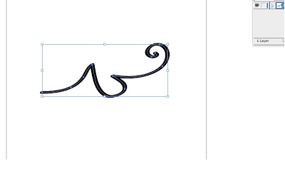
3. Create curves. This might take a little practive. One click places the start; where you want the curve to begin. The second click places the other end but before taking off with more clicks pull on the end to create the rounded line. I created a curve with three dots to give it more interest.

4.Now you need to go to the paintbrush icon and select your size of brush, I chose relatively small 8-9 pixels then later created a bigger one. Play around with the sizes and see what you like.

5.Now you need to select the pen again and right click. Choose to stroke the path.

6.Choose to stroke the path with a brush and select the simulate pressure button. This means there will be tapering on both ends like the streak actually starts and ends.

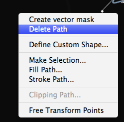
7.Once you press ok it will stroke your path with whatever color you have selected. I chose light blue to match the butterfly. Then right click and select to delete the path. This will leave the stroke of color but delete the graph that helped create it.

8.Right click on the layer and chose style this will open a pop up window with lots of options.
You can also click layer tab on top select style and a drop down bar will give you this options.

9.Select outer glow with a bright color, I chose another bright blue from the butterfly. Then go to Drop Shadow (shown below) set distance on 0, select Color Dodge for the blend mode and select a medium color from your image.

10.Now if you go to your layer box in the bottom right hand corner, right click on the layer we've been working on and copy layer style. Now you can create as many swirls as you want without repeating the layer style adjustments. Simply repeat steps 3, 5, 6 and 7 in a new layer, right click on the layer and paste layer style. Now every swirl you make will match the first, I went a little crazy but I was learning and having fun. If you want some thicker ones just repeat step number 4 and pick a larger pixel size.

1.First start with a photo, I selected one at random and made the background black. Apparently my sshot of the black screen didn't come out. But you can go to the paint bucket and color the background black. Don't forget to make a duplicate layer of your base and to save often.
 |
| Butterfly without background. From here you can add background color of choice and resize the image if you wish. |
2.Now you can create the extra effects.
Now go to the Pen tab.
3. Create curves. This might take a little practive. One click places the start; where you want the curve to begin. The second click places the other end but before taking off with more clicks pull on the end to create the rounded line. I created a curve with three dots to give it more interest.

4.Now you need to go to the paintbrush icon and select your size of brush, I chose relatively small 8-9 pixels then later created a bigger one. Play around with the sizes and see what you like.
5.Now you need to select the pen again and right click. Choose to stroke the path.
6.Choose to stroke the path with a brush and select the simulate pressure button. This means there will be tapering on both ends like the streak actually starts and ends.

7.Once you press ok it will stroke your path with whatever color you have selected. I chose light blue to match the butterfly. Then right click and select to delete the path. This will leave the stroke of color but delete the graph that helped create it.

8.Right click on the layer and chose style this will open a pop up window with lots of options.
You can also click layer tab on top select style and a drop down bar will give you this options.

9.Select outer glow with a bright color, I chose another bright blue from the butterfly. Then go to Drop Shadow (shown below) set distance on 0, select Color Dodge for the blend mode and select a medium color from your image.

10.Now if you go to your layer box in the bottom right hand corner, right click on the layer we've been working on and copy layer style. Now you can create as many swirls as you want without repeating the layer style adjustments. Simply repeat steps 3, 5, 6 and 7 in a new layer, right click on the layer and paste layer style. Now every swirl you make will match the first, I went a little crazy but I was learning and having fun. If you want some thicker ones just repeat step number 4 and pick a larger pixel size.


D2 Tutorial #1
How to make brushes in Illustrator.
 First, start by creating the shape you want to make into a brush, I used the brush tool on a standard setting.
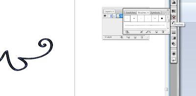 Now open the brushes panel.
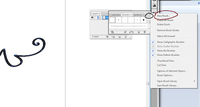 Use the menu and click 'New Brush'
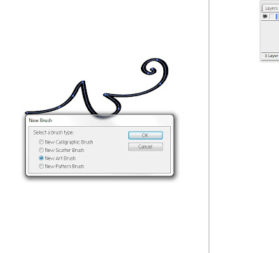 Select 'New Art Brush' and click 'OK'
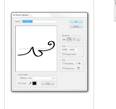 Now you can name your new brush and make some decisions on what direction you would like the shape to be in relation to the stroke and other details that you can customize. Click 'OK'.
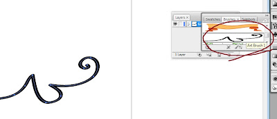 Now your new brush should be included in the brushes panel.
 Select it from the panel and use the brush tool to make a stroke.
 And watch as your new brush creates an interesting stroke by manipulating your original shape.
Enjoy.
D2 Tutorial #1 Amie
Zipper Text
I found a zipper brush online and saved it in the user defined brushes. Using the paintbrush tool I drew the word "zipper" with a graphic pen tablet and selected the whole word and applied the brush.


I also made a few adjustments to the image. Under the brush menu in brush options I changed the scale of the brush to make it fit the lettering. Then I selected the image again and went to Object>Group to group the separate paths together so I could enlarge or shrink the image.


When I made the lasso text logo I had a lot more steps, but I figured out a way to skip most of them and simplify it. I know this isn't a very long tutorial, but it did take me a long time to figure this out on my own. It turned out to be a pretty easy process in the end.
Monday, January 30, 2012
evolution of logos


great change versus little change. Which do you prefer? Which would you be more proud of if you owned a company?
D2 tutorial #1 j-clark
Since we have been working on logos lately and we all like to use dafont.com i thought i would do a tutorial on how to create a 3d font. (one step closer to creating our own fonts).


Create a new document in Illustrator with Size at 500×500pt.

2.Type the first letter of the word you want to create using the Type Tool (T); my first letter will be "D". Afterwards, switch to the Selection Tool (V), select the letter, then go to Type > Create Outlines (Shift + Ctrl/Cmd + O or right-click/Control-click on the letter in the artboard and then choose Create Outlines from the menu that appears).

3.Select the letter and go to Effect > 3D > Extrude & Bevel.In the Extrude & Bevel Options window, check the Preview option to be able to see what the letter will look like while we tweak the Extrude & Bevel effect’s options

4)Expand the letter by choosing Object > Expand Appearance. Next, ungroup the letter in order to have all its parts separated. Ungrouping the letter gives us the ability to apply colors and gradients to each part of the letter separately. You can ungroup the object by going to Object > Ungroup (Shift + Ctrl/Cmd + G). You might have to perform the Ungroup command several times because our letter contains a lot of parts.

5.First, make sure the Gradient Panel is open (Window > Gradient or press Ctrl/Cmd + F9).

For the front side of the letter, use a radial gradient.On the left side, use a linear gradient. Feel free to play with colors until you achieve your desired look.For the inner part of the letter, also use a linear gradient.
6.Let’s now add detailing to our letter by giving it some nice, highlighting edges. Select the front side of the letter, copy it (Ctrl/Cmd + C), then paste in front twice (Ctrl/Cmd + F).
Select the topmost copy with the Selection Tool (V) and nudge it 1px downwards and 1px to the right (use your Arrow keys). Keep this nudged copy selected. Now, Hold down Shift and click on the other copy to add it to the selection. In the Pathfinder Panel, hit the Minus Front button. This will leave us with one object that is just the non-overlapping part of both copies.


7.) And now that you've learned the basic steps for creating 3d text you continue to do the same things for the rest of your word until you get it like you would like.
Finished product.

Subscribe to:
Posts (Atom)