What are tracking and kerning?
Tracking creates an even spacing between multiple characters in a line of text, widening it out, or tightening it up.
Kerning adjusts the width of the space between two characters in a line of text.

Generally, you first track your text, and then make kerning adjustments.
1. Type out a line of text and choose a font. Look closely and notice that the spaces between the letters don’t really look uniform. If you’re not used to kerning type, you might not notice much, but trust me: Art Directors and Designers that work with type day in and day out WILL notice, and unkerned text will scream “unprofessional” to them. Luckily, it’s easy to fix.
2. Open the Characters palette (Type>Character), and notice the two input boxes at the bottom. (Illustration below). These are the Kerning (left) & Tracking (right) controls.
3. To track your text, select it and either a) enter values in the tracking input field, b) choose a preset number from the pulldown options, c) click in the input field and use the Right/Left Arrow keys, d) Shift + Command + Left/Right Bracket Keys, or e) hold down the Option key while using the Left/Right Arrow keys.
(Yes, that’s a lot of different ways to do the same thing). Higher values widen out the text, lower/negative values pull it closer together. (the two examples directly below) The tracking value is applied to the right side of the selected characters.
 4. To adjust kerning, use the type tool (T) to click between the two characters that you want to adjust the space between. Now, either a) enter a value in the kerning input field, b) choose one of the pre-set values from the pull-down menu, c) click in the input box and use the Up/Down Arrow keys to move through values, d) use Option+Left/Right Arrow keys, or e) Shift + Command + Left/Right Bracket keys. Like tracking, higher values will move characters further apart, while lower/negative values will move them closer together. (Note that while the preset options are helpful to get a general idea of your kerning values, you’re better of making precise adjustments yourself.)

 5. Many fonts have auto-kerning information built in. Choose “Auto” in the kerning box to use the values that the font designer has included with the font. Auto kerning usually looks pretty good, but again, you may want to use it as a starting point and fine tune it.
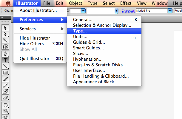
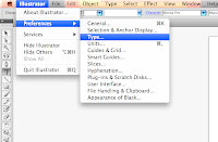 6. If you find that the default Illustrator kerning and tracking values are not precise enough for you, you can enter new measurement values in Preferences>Type & Auto Tracing. Illustrator is set to make adjustments at 20/1000 of an em per click but you can lower it for more control.
 An em is a unit of measurement that’s used with typefaces (originally based on the width of the letter M of the particular font). The em measurement of any given font is relative to the particular font size. So unlike a set unit of measurement like inches, which is always the same, an em width changes when you change the size or face of your text.
 7. Getting used to making kerning adjustments takes some practice. It’s a matter of taste in how you choose to kern characters. Experiment with loose tracking & kerning (Wide letter spacing) and tight tracking & kerning (close letter spacing). You’ll quickly begin to get a feel for how tiny adjustments can change the look and feel of your titles and headlines.
1. Type out a line of text and choose a font. Look closely and notice that the spaces between the letters don’t really look uniform. If you’re not used to kerning type, you might not notice much, but trust me: Art Directors and Designers that work with type day in and day out WILL notice, and unkerned text will scream “unprofessional” to them. Luckily, it’s easy to fix.
2. Open the Characters palette (Type>Character), and notice the two input boxes at the bottom. (Illustration below). These are the Kerning (left) & Tracking (right) controls.
3. To track your text, select it and either a) enter values in the tracking input field, b) choose a preset number from the pulldown options, c) click in the input field and use the Right/Left Arrow keys, d) Shift + Command + Left/Right Bracket Keys, or e) hold down the Option key while using the Left/Right Arrow keys.
(Yes, that’s a lot of different ways to do the same thing). Higher values widen out the text, lower/negative values pull it closer together. (the two examples directly below) The tracking value is applied to the right side of the selected characters.


1 comment:
this is very important info!!! Learn this and then impress John Green with your graphic design knowledge from this class
Post a Comment