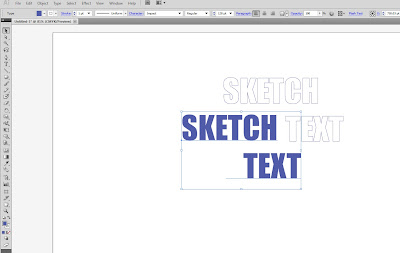
Step 1 - Write out a couple of words you want, and choose the font you want. I chose Impact for the font because it will be thick enough to get the sketch effect I'm going for.
Step 2 - Make the font's fill white and give it a stroke of the color of your choice.
Step 3 - Make another copy of the same words, but make the fill of this copy the color of the stroke on the first; don't have a stroke on the copy. Then put the copy over the original.

I also thickened the stroke on the bottom text layer to make it a bit heavier.
Step 5: Go through and add some lines using the line tool for a more sketchy feel. Try different thicknesses, types of lines such as dashed lines and different brushes if you want more organic looking strokes.


1 comment:
I would like to try this technique some time.
Post a Comment