


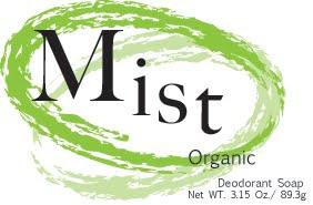
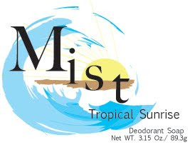
These are my mist soap logos. The original logo that i created each of the covers of soap is at the top left side. I changed the color and the ellipses around the word mist in every soap. I was trying to keep the cover simple as well as to read clean as in soap. I put more image in the tropical sunrise soap cover because i thought it read better this way, while i fell the other cover project there intending purpose with out the extra imagery.
6 comments:
I think these are really nice and look real. My only criticism would be that the beach and sun in the Tropical Sunrise is distracting. The others are so clean and elegant!
I like these a lot
the tropical sunrise one looks good. i like how it makes a wave.
Your's are probably my favorite, the tropical one is the bomb. I would have chosen a different font and kept it inline personally, but your's looks great all the same. Good job.
Yours are awesome! I wish there would have been a way to make the tropical sunrise one matched the others better! But it looks good!
Marla is right on IMO. Tropical Sunrise is the least refined and doesn't match the rest of the line. "less is more" The sun and the beach are more than is necessary
Post a Comment