The first thing that you need to do is find a good portrait headshot.
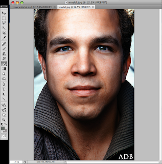
Once you have found this you may want to crop out any extra part, in the case of this picture that would be the his neck and top of this jacket.
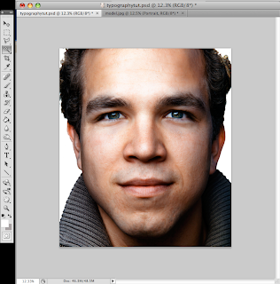
After cropping the photo you are going to want to rename the background layer by double clicking it and rename it something like "portrait" after doing this you will create a new layer under the portrait layer and fill it with #FFFFFF or pure white, and then using the magic wand tool remove the background from the portrait layer.
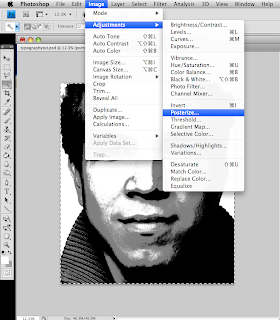
once you have done this you will desaturate the picture by going to image>adjustments> desaturate. Then you will need to posterize the image by going to image>adjustments>posterize and set it to 3 or 4.
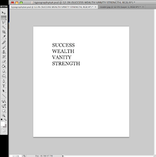
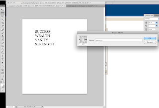
Hide the portrait layer by clicking the eye, and then using the type tool, write out a few words as seen below.
Next we will need to create a brush preset for all of the words that we typed by selecting them using the rectangular marquee tool and then going to edit>define brush preset.
You will do the same for the rest of the words as well.
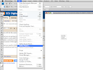
Next we are going to the customize a fill pattern. go to edit>free transform and reduce the words to very small like what I have done. Next hide all other layers except these words and make a selection around them and go to edit>define pattern. now that pattern is saved and you can access it through the pattern preset window.
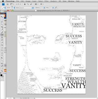
Next we need to hide the text layer as we dont need it. unhide the portrait layer and then use the selection tool to make a selection like I have
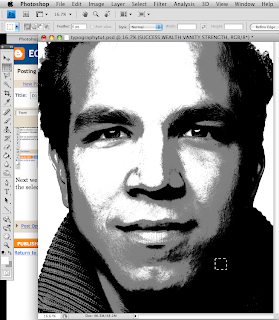
With the small area selected you will go to select>similar and this will select all areas of the same color
Now we need to hide the portrait layer which will just leave the selected section and from there we will create a new layer and use that to begin to stamp our words that we made earlier, the key is to try and adjust the sizes so that they fit well within the selection
now we will need to fill in the rest of the space with the pattern that we made earlier, to do this will need to create a new layer that is beneath our stamped text layer and fill it with the text pattern.
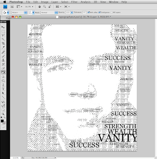
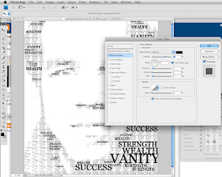
you will notice that this obscures some of the stamped text that we had previously made so we will need to add a drop shadow to our stamped text layer which you can do by double clicking the layer and selecting drop shadow, I would suggest using about 70 percent opacity just to darken things up a bit.
and now we just repeat the same steps on the next tone of gray in the picture, except when filling in on the next tones of gray you will want to make your text a lighter color so that it doesnt match your first set as well as changing the opacity of the paintbucket when you go to fill in the background
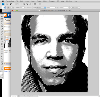
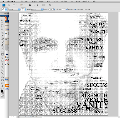
the final outcome will look something like this.
3 comments:
i really like this tutorial! great job!
kew
creative
Post a Comment