
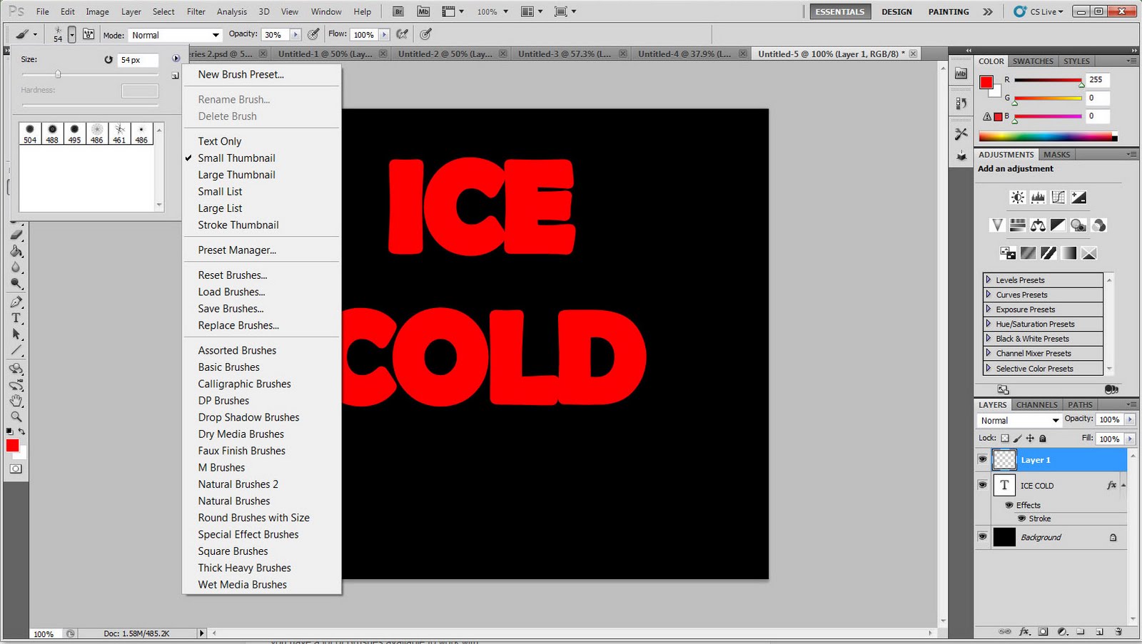
My tutorial is over adding an ice effect to text.
Step 1: Choose the font/font size. I made the background black so that the ice will stand out when it's complete. I also chose a fatter font so the ice will have more detail, and made the text red so that there will be a little red hue in the ice.
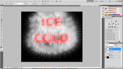

Step 2: I fattened the font a little more so that it would be more rounded and natural looking. I then went into the brushes, and clicked the little black arrow beside the master diameter. I then chose a brush that would give me a cracked ice look. You can download other brushes if you wish.


Step 3: Next, I made the color for the brush white, and used different diameters for different sizes of cracks on the text. Set the brush to low opacity so the cracks look more natural.


Step 4: Get rid of all the cracks around the text that you don't want. I used the eraser tool.
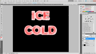
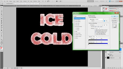
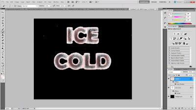
Step 5: I then went to Layer>Layer Style> Blending Options. On the left I chose the 'drop shadow' option, and under 'blend mode' I chose 'screen'. This gave the text a little more dimension.
Step 6: Make the ice a little more "ice-like". I used a basic brush with soft edges on low opacity, selected a dark color out of the text, and got rid of some of the red so that it looks more like a red light that is being cast on the surface. I then chose white, and went around the edges of the text and where the letters connect to each other, to make the letters look like they are frozen to one another.
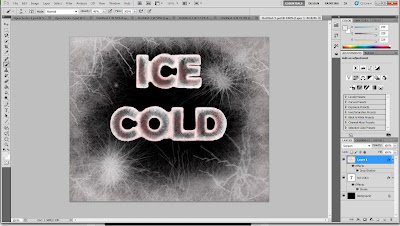
Step 7: After all this, I used the special brushes again on low opacity to get a cracked icy effect around the text as well. This isn't necessary, but I wanted something surrounding the text so that it wasn't as plain.
3 comments:
pretty cool! I like the icy words by themselves without the extra ice added at the end
whoa! Nice!!!
Thanks! Something went wrong with the text so it looks weird on the blog.
Post a Comment